

This was an addition to the prior weeks' project of cropping abstract compositions of circles, squares, and triangles. The goal was to make unique dynamic compositions by adding letterforms in a way that adds to the composition without being too focused on the letterform.

This was an addition to the prior weeks' project of cropping abstract compositions of circles, squares, and triangles. The goal was to make unique dynamic compositions by adding letterforms in a way that adds to the composition without being too focused on the letterform.

This used everything we had learned using cropped abstractions, letterforms, and shades as well as adding imagery and type.

Using paint and random objects we collected, we experimented with creating different textures and patterns.

This was an addition to the prior weeks' project of cropping abstract compositions of circles, squares, and triangles. The goal was to make unique dynamic compositions by adding letterforms in a way that adds to the composition without being too focused on the letterform.

Images made out of combinations of photos we took of texture, handmade texture, and the patterns we made in Illustrator.

Using all of our experiments in texture and pattern, we made posters that worked to incorporate all the elements in a fluid or mechanical way. I experimented with both fluid and mechanical.

After making a grid and choosing a color scheme and one photo texture, one handmade texture, and one pattern, we used a series of random number generators to fill in the poster following a list.

An assignment based around capturing both light and shadow in multiple images.

In this assignment, we made two unique forms out of paper, one curved and one straight. We then had to photograph it in the studio trying to best capture and exaggerate the lines and curves.

In this project, we chose an object to study through photos. I chose a camera lens.

This was a semester-long assignment where we picked a subject to focus on and create a gallery out of it. I chose to focus on letterforms and type, photographing signs, graffiti, and anything else with letters that I found around my daily routine.

Our first project involved using the font Zapf Dingbats to create calendars without using any letters, numbers, or words. The goal was to organize the shapes in a way that would be interpreted as a calander.

The goal of this project was to design posters that encapsulate the feeling of the 2024 Lollapalooza festival. We started with black and white versions then worked on adding color and image.

Our first project was to pick a word and create pictograms of it with these four different grids, each getting more detailed. I chose to make a fish.

Our second project was to create a grid and design our own typeface from it. I started with various ideas and iterations before settling on a thin, condensed, rounded style.
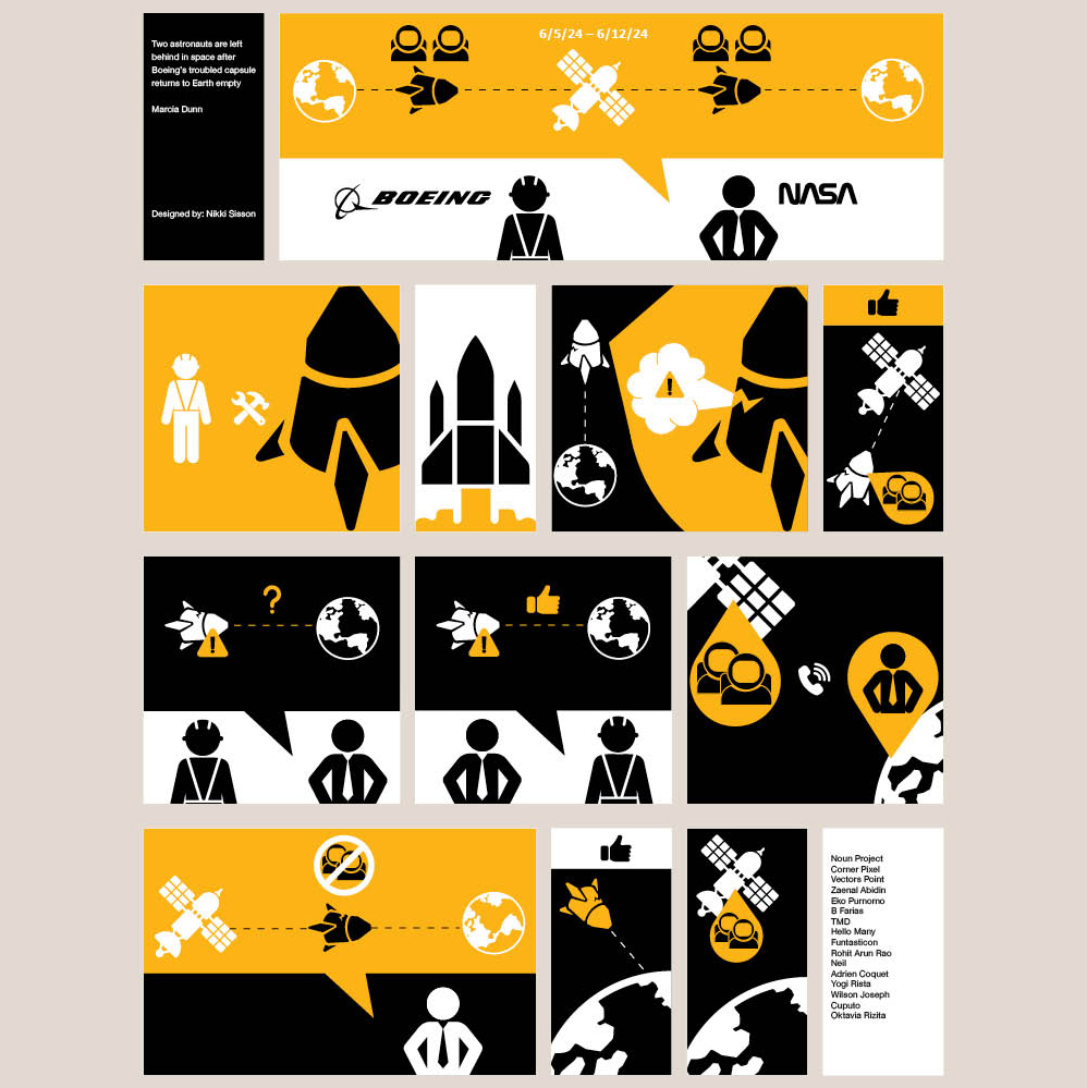
We were tasked with telling a news story using only symbols and black and white and one color. I chose the story of the Nasa astronauts who were stuck on the space station after the space shuttle they took experienced technical issues. You can read the story here.